

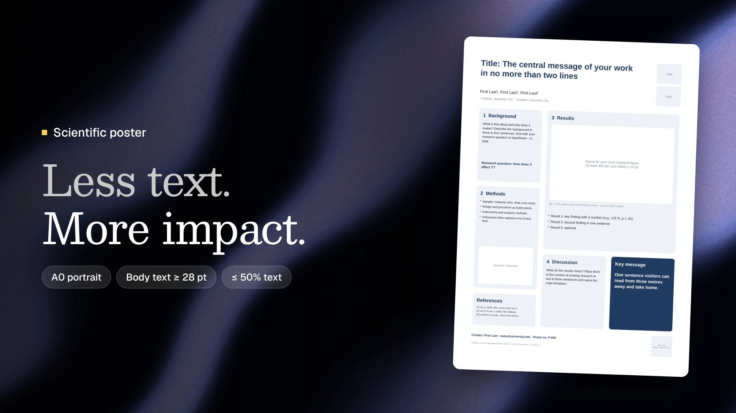
A scientific poster summarizes a research project on a single surface – usually A0 – and is presented at conferences in a poster session. A good poster works on three levels: from three metres away it sparks interest, from one metre it explains the key message, and in conversation it delivers the details.
This guide shows you how to create a scientific poster step by step: layout, dimensions, font sizes, design rules and common mistakes. You can also download a free A0 PowerPoint template.
Key points at a glance
- Format: usually A0 portrait (84.1 × 118.9 cm) – always check the conference guidelines first.
- Structure: title, background, methods, results, conclusion, references and contact.
- Fonts: title 72–90 pt, headings 44–56 pt, body text at least 28 pt.
- Text: no more than half of the area, about a third for figures.
- Key message: one sentence readable from three metres away.
What is a scientific poster?
A scientific poster is a large-format visual summary of a piece of research. It is displayed at congresses and conferences in a poster session: authors stand next to their poster, visitors walk past, stop at topics that interest them and start a conversation.
That makes a poster fundamentally different from a paper. A paper is read; a poster is skimmed in passing. Most visitors decide within seconds whether to stop. A poster is therefore an invitation to talk rather than a text to read from top to bottom.
To present a poster, you usually submit an abstract in response to the conference's call for papers. Once it is accepted, you receive the format and schedule requirements.
Structure: what belongs on a scientific poster
The structure usually follows the classic research paper format, heavily condensed. The results get the most space.
- Title: State the key finding, not just the topic. "Mindfulness training reduces exam anxiety in students" works better than "A study on mindfulness and exam anxiety".
- Authors and affiliations: Names, institutions, logos. Keep this line lean.
- Background and research question: Three to four sentences of context, then the research question or hypothesis – highlighted.
- Methods: Sample, design, instruments and analysis as bullet points. A flowchart often replaces an entire paragraph.
- Results: The heart of the poster. One or two strong figures with self-explanatory captions, plus a few key numbers.
- Discussion and conclusion: What do the results mean? Place them in context briefly and name the main limitation.
- Key message: One sentence, large and highlighted – the one thing visitors should take away.
- References and contact: A selection of three to five sources in smaller type, plus an email address and optionally a QR code linking to the paper, the data or a PDF of the poster.
The order is not set in stone. Some posters deliberately put the results in the centre and the methods at the edge. What matters is a clear reading path: in columns from top to bottom and left to right.
Format and size: how big is a scientific poster?
The standard at most European conferences is A0 portrait. Many organizers specify the format in the call for papers or the speaker guidelines – not every poster board fits every format. North American conferences often use landscape formats such as 48 × 36 inches.
| Format | Dimensions | Typical use |
|---|---|---|
| A0 portrait | 84.1 × 118.9 cm (33.1 × 46.8 in) | Standard at most scientific conferences |
| A0 landscape | 118.9 × 84.1 cm | When boards are wider than tall; only if specified |
| 48 × 36 in landscape | 121.9 × 91.4 cm | Common at North American conferences |
| A1 portrait | 59.4 × 84.1 cm | Smaller meetings, student conferences |
| E-poster | usually 16:9 (e.g. 1920 × 1080 px) or 9:16 | Digital poster sessions on screens |
Create the document at its final size from the start. Designing in A4 and scaling up leads to blurry figures and wrong font sizes.
Design: font sizes, colours and figures
Font sizes for an A0 poster
The most important rule: body text must be readable from one to two metres away, the title from several metres. These values have proven effective:
| Element | Font size (A0) |
|---|---|
| Title | 72–90 pt |
| Authors | 40–48 pt |
| Section headings | 44–56 pt |
| Body text | 28–36 pt, at least 24 pt |
| Captions | 24–28 pt |
| References, footnotes | at least 18–20 pt |
A simple test: print the poster on A4. Whatever you can read comfortably there will be readable on A0 from about one metre. Whatever is too small on A4 is too small on A0.
Typefaces
Use a readable sans-serif typeface such as Arial, Calibri, Helvetica or Source Sans for body text. A serif typeface is possible for the title but not required. Stick to two typefaces at most and use bold and italics sparingly and consistently.
Colours and contrast
- A light, calm background – usually white – with dark text is the most readable.
- No more than three to four colours: one main colour, one or two supporting colours and an accent for the key message.
- Ensure strong contrast. Light grey text on white is barely readable under exhibition lighting.
- Around eight percent of men have red-green colour vision deficiency. Do not distinguish data series by red and green alone; use brightness, patterns or labels as well.
- Use your institution's colours if there is a corporate design.
Figures and charts
- About a third of the area should consist of graphics: charts, photos, flowcharts, tables.
- Use images with at least 300 dpi at final size, and charts ideally as vector graphics (SVG, EPS or PDF exported from your statistics software).
- Axis labels and legends need the same minimum size as body text.
- Every figure gets a caption that states the finding – not just the content.
- One large, clear figure beats four small ones.
White space and grid
Divide the poster into two or three columns with even spacing. Empty space is not wasted space: it guides the eye and makes the poster calmer. As a rule of thumb, text should take up no more than half of the area. On an A0 poster, 500 to 800 words is usually the upper limit.
Template: scientific poster in A0 to download
So you don't have to start from scratch, we have created a PowerPoint template. It also works in Keynote, LibreOffice Impress and Google Slides.
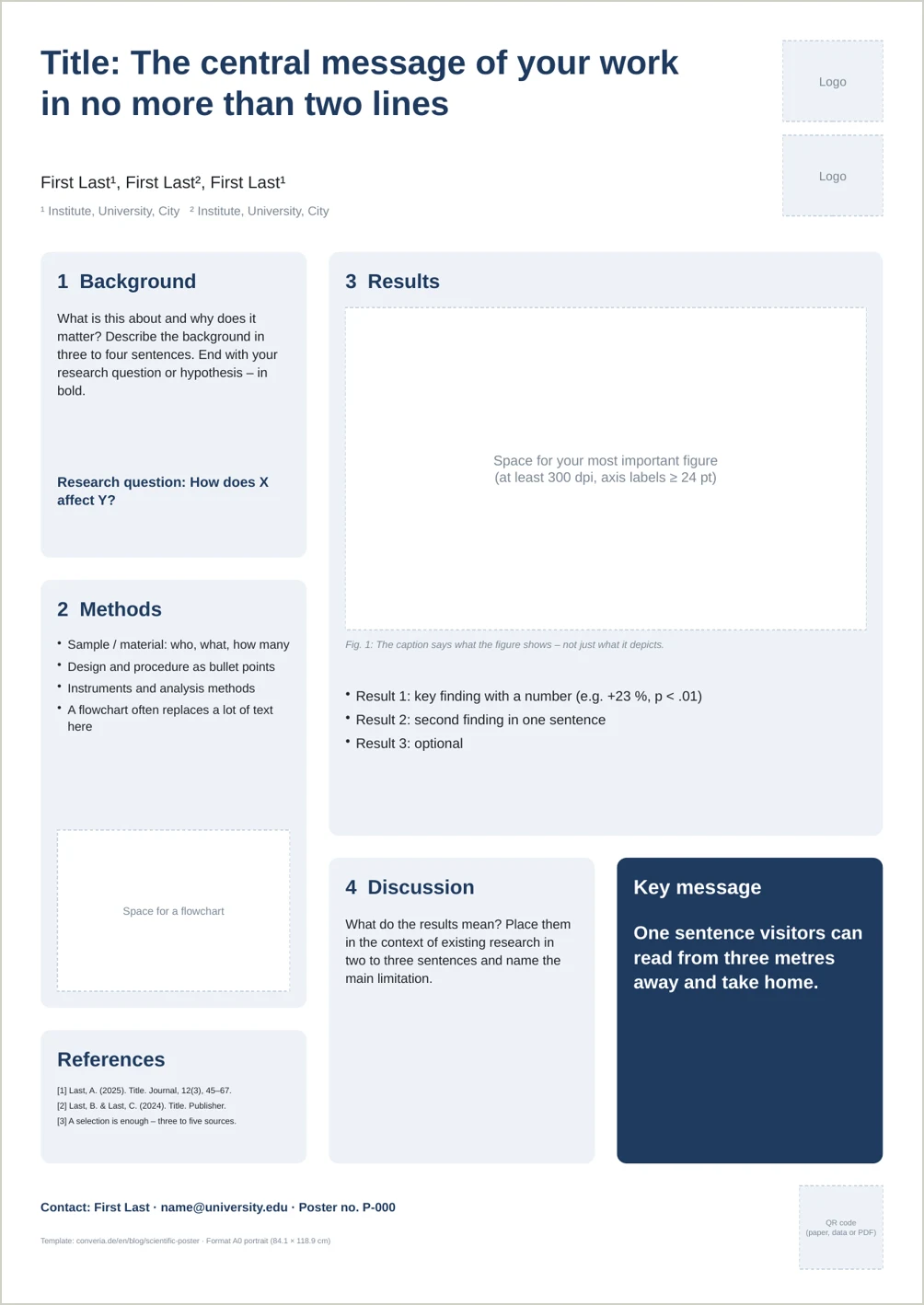
Download the scientific poster template (PowerPoint, A0 portrait)
Free, no sign-up required. The template includes:
- A0 portrait format (84.1 × 118.9 cm), set up at final size
- Three-column grid with areas for background, methods, results, discussion and references
- Preset font sizes based on the recommendations in this guide
- Placeholders for logos, figures and a QR code
- A highlighted box for the key message
- Colours adjustable in one step via the theme colour scheme
Replace the guidance text with your content and delete any areas you don't need. To match your corporate design, change the colours in PowerPoint under Design → Variants → Colors.
How to create a scientific poster: step by step
- Define your key message. Write down in one sentence what visitors should take away. Everything on the poster serves this message.
- Check the requirements. Format, orientation, deadlines, printing specifications, mandatory logos: you will find them in the call for papers or speaker guidelines.
- Sketch the layout. Draw it on paper or sticky notes before you open any software. This lets you test the reading path and weighting.
- Figures first. Create or revise your most important figure before writing text. It determines the layout.
- Write and cut. Use short sentences and bullet points. Then cut by another third.
- Print a test copy on A4. Check readability, contrast and typos. Ask someone outside your field: do they get the key message in 30 seconds?
- Create the print file. Export a PDF at final size with embedded fonts, ideally PDF/X for print shops. Allow several working days for printing.
Which software should you use for a scientific poster?
| Software | Best for | Note |
|---|---|---|
| PowerPoint / Keynote | Most posters | Widely available, templates exist, set slide size to A0 |
| Google Slides | Team collaboration | Set a custom size, export as PDF |
| LaTeX (tikzposter, beamerposter, baposter) | Formula-heavy disciplines | Precise layout, steeper learning curve |
| Adobe InDesign / Illustrator, Affinity | Sophisticated design | Professional prepress, paid |
| Inkscape | Vector graphics at no cost | Free and open source |
| Canva | Quick drafts | Many templates, limited for scientific charts |
PowerPoint is perfectly adequate for the vast majority of posters. A clear structure and good figures matter more than the software.
What good examples have in common
Successful scientific posters look very different, but they follow the same principles:
- The message is in the title. Anyone who reads only the title already knows the outcome.
- One figure dominates. The eye lands on the central result immediately.
- The reading path is obvious. Numbered sections or clear columns guide visitors through the poster.
- There is white space. The poster looks tidy rather than crammed.
- Details are offloaded. A QR code leads to the paper, data or supplementary material.
A much-discussed alternative to the classic layout was introduced by psychologist Mike Morrison in 2019 under the hashtag #betterposter: the key message appears in large, plain language in the centre of the poster, with details moved to the sides. Whether this format suits your discipline depends on the conference – but the "key message first" principle is worth applying either way.
Common mistakes on scientific posters
- Too much text: The poster as a printed paper. Nobody reads 2,000 words standing up.
- Fonts too small: Body text below 24 pt, tiny axis labels in charts.
- Unclear message: A topic instead of a finding in the title, no recognizable key message.
- Busy design: Colourful backgrounds, too many colours and typefaces, images behind text.
- Blurry figures: Screenshots or graphics exported too small that pixelate at large size.
- Wrong format: Landscape instead of portrait or A1 instead of A0 – and the poster doesn't fit the board.
- No contact details: Interested visitors can't reach you after the session.
Printing and presenting in the poster session
Printing
- Many universities offer poster printing at low cost. Alternatively, use a copy shop or online printer.
- Paper is cheap but fragile and needs a poster tube. Fabric posters can be folded and packed in a suitcase.
- Allow several working days for printing, including shipping for online printers.
Presenting
- Prepare a short introduction of 30 seconds to two minutes that you can offer in every conversation.
- Stand next to – not in front of – your poster and approach visitors actively.
- Bring A4 printouts or business cards with a QR code.
- Ask the organizers about mounting material. Many provide pins or adhesive dots, some do not.
E-posters
More and more conferences use e-posters displayed on screens or in a conference app. Different rules apply: landscape instead of portrait, less text, larger fonts. Some allow animations or videos. Check the requirements for format, file type and resolution carefully.
For organizers: how to get better posters
The quality of a poster session depends heavily on how clear the requirements are. Organizers can do a lot:
- State format, orientation and deadlines in the call for papers.
- Provide a template – or link to this guide.
- Give the poster session a prominent slot in the programme instead of hiding it in the coffee break.
- Offer poster awards and organize moderated poster walks.
Organize poster sessions with Converia
With Converia, authors submit their poster abstracts online, reviewers assess them, and accepted contributions go straight into programme planning – including poster numbers, poster file uploads and e-posters in the conference app. Learn more about abstracts, review and program planning in Converia.