
1. Size matters
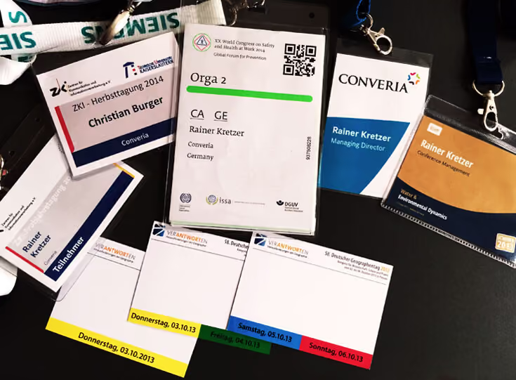
When it comes to badge dimensions, organizers should avoid the two extremes. If the badge is too large, you might be able to fit a lot of information on it, but most of that will likely be secondary or even redundant (see point 2). Conversely, a name tag that is too small can quickly become a major issue for attendees.
This comes down to readability: If the information on the badge isn't clear at a glance, it can discourage attendees from approaching someone they don't know. A name or an affiliation is often all it takes to strike up a conversation. The same applies if someone has forgotten the name of a person they already know; a quick glance should be enough to jog their memory.
If it doesn't work instantly, the badge has failed. It ends up hindering social interaction rather than fostering it.
Run a test and answer these two questions:
- Can you still read the name on the badge from a distance of about four to five meters?
- Especially with badges that use color: does it work just as well under different lighting conditions?
📐Adrian Segar schlägt in seinem viel diskutierten Blogartikel zum Thema Badges für horizontale Schilder eine Größe von etwa 10 cm x 8 cm vor, während solche mit vertikaler Ausrichtung mindestens 10 cm x 15 cm groß sein sollten.
2. What belongs on the badge?
The one thing that is absolutely, without exception, the most important element on every single conference badge: the name.
🌟Always place the name prominently on the badge. It is the undisputed highlight.
The larger the font, the less you'll struggle with readability. We recommend at least font size 72 for first and last names. Some organizers choose to highlight one of the two names more prominently. Use larger first names for conferences where using first names is the standard. If you aren't sure if that's appropriate for all attendees, it's better to play it safe.
🔍Because names vary in length, always reserve extra space in your design template for longer ones. Sometimes a slightly smaller font size helps, but be careful not to compromise readability. Don't reduce the font size globally; only adjust it for the specific badges that need it.
After attending more than 300 conferences, Brian Fitzpatrick had the idea in 2017 to create a review site for badges. None of them really impressed him back then, but it's still worth taking a look at the negative examples.
It is unfortunately a myth that organizers can simply look at well-known conferences to see how to do name badges right. One from the collection stands out in particular: The organizers of the annual developer conference Microsoft Ignite seemed to think their own name was more important than the names of the attendees. In any case, the attendees' names get pretty lost on the badges.
Well, that was 2017. Surely someone has noticed by now? Surprise: no. While the Ignite conference badge has gained more color, the fundamental issue with font sizes still persists seven years later, at least at the Austrian offshoot.
So, let's move on quickly to a tip on how to improve your badge: after the name, include the university or institution the person is affiliated with. This is another piece of information that shouldn't be underestimated, as it can help many people find an entry point for a conversation.
It is also useful to include the person's role on the name tag. This makes it immediately clear to everyone whether someone is attending the conference as a volunteer, an attendee, or a speaker.
Which logos make sense on a conference badge?
Even very minimalist badges should at least feature a logo or the name of the conference. That is perfectly fine.
However, if the conference or sponsor logo is larger than the attendee's name, it sends a subtle message about the ego of the people behind the event. If you want to avoid sending hidden messages, make sure the logos don't take up too much space.
💡If you are struggling with space, sponsors can alternatively go wild on the lanyards. This has another advantage: The more space logos take up on badges, the more present they appear. But the mood also shifts, and that presence starts to become annoying. This bothers attendees and ultimately harms the sponsors, who want their brand to be seen in a positive light.
Social media on badges – yes or no?
It depends on the composition of your attendees. A conference hashtag and a person's profile name are only helpful if you know that the vast majority are very active on a specific social network. Otherwise, the two X (formerly Twitter) users will likely find each other on their own or already know each other because they’ve been following one another for ten years.
❌Get rid of all unnecessary information! You rarely need more than the basics. You never need the date and location of the conference. If attendees have received their badge, they have usually already made it to the right place at the right time.
What goes on the back of the badge?
Our best and long-proven recommendation: Print the attendee's details on both sides of the badge. This is practical because some badges tend to flip over during the conference without anyone noticing. It doesn't matter if the name is on the other side, too.
Our clients therefore highly value the tear-resistant butterfly badges and we have even heard attendees say: "Finally, someone thought of that."
A few years ago, some conferences started adding a schedule to the back of the name tags. At large conferences, this sometimes turned into an entire booklet. On one hand, nobody wants to wear that around their neck all day.
Alternatively, attendees can check the conference app for the schedule. This method has the advantage over a printed version that the plan remains up-to-date even if there are last-minute changes.
Conference badge with an extra feature
A great idea: The badge doubles as a ticket for public transport in the city where the conference is taking place.
Thanks to this additional feature, attendees get to see more of the city and don't have to worry about how to get from A to B. This is especially useful for international attendees who don't use a local transit pass and don't want to get lost in a jungle of fare zones.
3. Designing for impact – but how?
Can the badge be colorful?
If you work with colors, there is nothing wrong with that – it's even better if there is a system behind it. Perhaps you can link this to the roles described above: Mark each role with a different color or symbol. For example, the role could be printed on a colored bar at the very bottom of the badge. With the help of the color, you can immediately see which specific ticket a person has booked. If someone wanders into the wrong workshop, the name tag will stand out.
Finding the right font for the conference badge
Choose a sans-serif font. Such fonts are easier to read from a distance. This is also why experimenting with fancy fonts is generally not worth it; they always perform worse in this regard than the less exciting ones.
Use only a single font on the badge to make your work easier. If you use more than one, you need a good eye for which fonts harmonize well with each other.
🆎Also, avoid writing names entirely in capital letters. All-caps fonts, which lack lowercase letters, are often harder to read. The names on the badge should be easy for attendees to grasp at a glance.
4. What works best for badges: stickers, clips, or lanyards?
What is the best way for attendees to wear their finished name badges at the conference?
Especially for multi-day events, stickers are not a good solution. Their adhesion varies depending on the fabric. Even if that isn't an issue, you would need to provide new ones for every day of the conference. It is rare for people to wear the exact same outfit for the entire event.
While pins don't have these problems, attaching and removing them can be a challenge for those who aren't particularly dexterous. Furthermore, some badges will shift throughout the day and end up hanging crookedly.
Clips are also only a limited solution. Not everyone has a pocket on their clothing to attach one to.
A better option would be magnetic clips. While they are slightly more expensive, they can be attached quickly and easily anywhere. However, this method has its pitfalls: if a magnetic clip is stored in a bag alongside a smartphone or a credit card with a magnetic stripe, it could potentially cause permanent damage. Attendees with an implanted pacemaker or defibrillator should never wear magnetic clips.
✅The best option is therefore lanyards. Attendees can put them on quickly, take them off at the end of the day, and they work just as well the next day. If your lanyards come in different colors, you can also use them to indicate a person's role at the conference.
However, lanyards that hang too low might be uncomfortable for some people, as they can draw attention to areas they would rather not highlight. It is best to use the adjustable-length version. This allows everyone to decide for themselves how their badge sits best.
5. For the sake of the environment
Until a few years ago, plastic badge holders were standard at conferences. Today, many organizers are rightly asking whether conferences really need so much plastic.
💪Badges made from tear-resistant paper are durable enough to make holders unnecessary.
If you want to design even more eco-friendly name badges for your conference, there are several options available regarding materials, printing inks, and even fonts.
How many badges does a conference need?
The question might seem strange at first. As many name badges as there are attendees, obviously.
Organizers who choose to print badges on-site don't really need to worry about this. Everyone else does, because when ordering badge paper, manufacturers often force organizing teams to order a specific quantity. Due to minimum order quantities, organizers of smaller conferences often have to buy more paper than they need. But larger conferences also struggle with this if the manufacturer only sells the sheets in pre-packaged bundles. A conference with 190 attendees then has to buy the pack for 250 name badges and pay accordingly.
This has bothered us at Converia for a long time. After all, this kind of paper waste is not particularly sustainable. That is why we always provide our clients with exactly as many name badges as they actually need. If a conference needs 234, we print exactly 234.
Finally: stay calm
With all these theoretical considerations, please don't forget: this is just a name badge. It is extremely important at the conference and must not be missing, but it doesn't need to be more scientific than the content of the conference itself.
Is the name on it? Can you read it? Is the badge durable enough to stay that way throughout the entire conference?
If you can answer all three questions with "yes," you have already completed the majority of the preliminary considerations. This is the foundation for ensuring it has the desired impact and helps participants connect with one another. You can then proceed with further planning, knowing that nothing can go wrong.
🧪More tips for experimenting with conference name badges:
- Large, small, plastic, electronic, with or without microchips: badges come in a wide variety of forms. Not every type is equally well-suited for every kind of event.
- We explain in this article why "biodegradable" name badges don't have much to do with sustainable practices and what an eco-friendly badge can look like instead.
- How easy or difficult is it for participants to print their own name badges on-site?
- Would you like to spend less time dealing with name badges? Tell us what you have in mind, and we will work together to find a solution for your conference.