
Do you dread every upcoming presentation?
You'll have one less thing to worry about in the future, as we highlight the four most common presentation mistakes and provide tips on how to avoid them.
1. Boring titles, boring bullet points
If your presentation is filled with slides titled "Introduction" and "Objective," and every single one contains nothing but long-winded bullet points, it's time for a change.
You can capture or maintain the audience's interest with the help of meaningful headlines.
"Easier handling" sounds better than a simple "Advantage 1." It will be easier to formulate individual titles if you add them only after you have determined what information the slide should contain.
Draft the basic structure of your presentation before you start designing the individual slides.
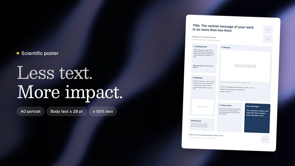
The more text a slide contains, the longer the audience's gaze will remain fixed on it. As long as your audience is busy reading the text, you are no longer the center of attention.
The art lies in limiting the text to the essentials. Reduce each slide to exactly one main point. This is usually easier for anyone who has been active on Twitter. Messages there are limited to 140 characters. If you find it difficult to formulate your main point, set yourself a character limit.
It is even better not only to put your statements into words but also to support them with images. However, always make sure to use the highest quality version of the graphics possible (approx. 300 dpi).
If you want to project formulas onto the wall, use the formula editor or scan them in.
However, caution is advised with images from a legal perspective. If you use graphics that you did not create yourself, they are generally protected by copyright. If no license terms can be found, you must ask the respective authors for permission. Even more information on copyright for images can be found on the blog of attorney Thomas Schwenke.
2. Standing out at any cost
At almost every conference, there are presentations that stand out. Some of them stand out from the crowd less because of their scientific content and more because of their unfavorable design. Sometimes the questionable design even draws more attention than the content itself.
Avoid sound effects and animations. Flying or rotating text and images won't send anyone into a frenzy; at best, they will just provoke an eye-roll.
Subtle restraint is also required when choosing fonts. While unusual fonts may catch the eye, overly playful or ornate fonts are definitely a bad idea. The audience will have trouble deciphering the words. And no matter where you are, fans of Comic Sans are most likely in the minority.
Your choice should therefore always be a highly legible font. Whether with or without serifs, classic or modern—as long as readability is guaranteed, there is generally nothing to be said against it. To ensure everything is easily visible from the back row, a font size of at least 20 pt is recommended.
If you don't want a monotonous single-color look, you are of course welcome to adjust the font colors.
The individual colors should complement each other and, if possible, not be used arbitrarily. A color change is useful for headings, for example, or to mark a new chapter.
The contrast with the background is always important. Yellow text on a white slide will not go down well with the audience.
Typos or missing words also leave a negative impression.This suggests that the presentation was only created on the way to the event. To avoid such an impression, it is best to read through what you have written one more time in peace and quiet beforehand.
3. Presenting does not mean reading aloud
The presentation should support your talk and not repeat exactly what you are saying anyway.
Consequently, it is not about reading from the slides, but about speaking as freely as possible.
Those who just read aloud have a hard time with the audience. The speaker not only appears tense but also gives the impression that they are not truly familiar with the subject matter.
A change of perspective is also helpful when preparing a talk.
Put yourself in the listeners' shoes. Ask yourself what they expect from your presentation and what might surprise them.
Think back to your own experiences. Perhaps you have sat in the audience for other presentations on a similar topic. Consider what the speakers did well and how you could use that for your own talk.
In any case, maintain eye contact with your listeners. If you turn your back on the audience because you are reading the text on the screen or staring at your laptop or the floor the whole time, it looks anything but confident and convincing.
You can also express self-confidence through your way of speaking.Speak clearly and not too quickly. Formulate </w2><w3>short sentences. Complicated phrasing will increase your nervousness the moment you get tangled up in your own sentence structures.
Even if you are speaking to an expert audience, you should not automatically assume that everyone in the room has the same level of knowledge as you. In some places, an additional explanation may therefore be necessary, without which many would no longer be able to follow you.
4. The following presentations are expected to be delayed by 30 minutes
Even the most interesting talk must come to an end eventually. Especially at conferences, the factor of time plays an important role.
This does not mean that you have to time your talk to finish your last sentence to the millisecond, but anyone who takes significantly longer than the allotted time strains not only the audience's concentration but also the patience of all subsequent speakers.
Going over by two minutes may not sound particularly dramatic at first, but with a scheduled presentation time of ten minutes, two extra minutes already mean a 20% extension.
Therefore, test beforehand whether you can keep to the time. This has an additional positive effect: you internalize your presentation, which will benefit you when speaking freely.
If you notice during the talk that time is running short, it is better to omit points that do not contain essential information. However, you should never skip important key messages.
Stick to the topic at hand and focus on the facts. If you spend too much time justifying your approach out of fear of criticism, you will usually end up wasting too much time. Of course, it is not wrong to prepare a few arguments in advance, but save them for later in case someone actually asks a critical follow-up question.
To help you prepare even better for your presentation, we also recommend the following checklist in the form of a presentation:
Why does this presentation look so different from all the ones you have created before?
The answer will be revealed next week. That is when we will introduce five PowerPoint alternatives to help you enhance the visuals of your presentations.